All About the Blues: A LomoChrome Turquoise 100-400 XR Film Review
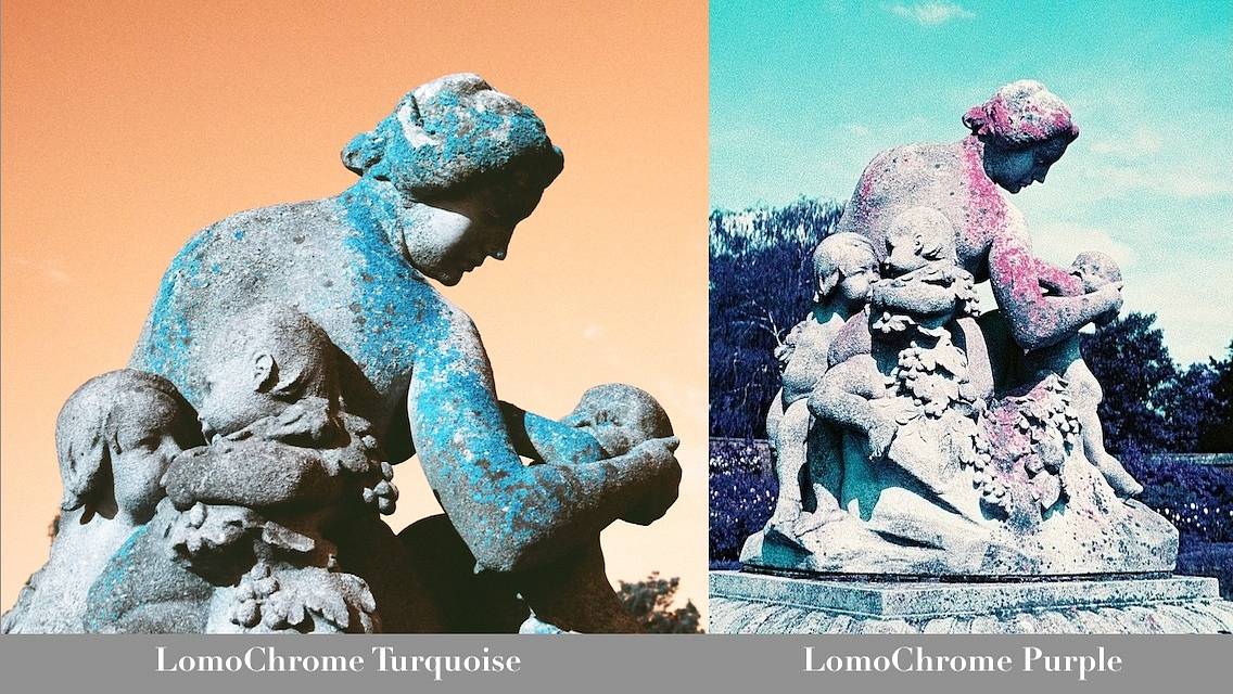
7 42 Share TweetMore than a year after the arrival of LomoChrome Purple , little brother LomoChrome Turquoise was born. How does the new kid fare? Any sibling rivalry?

It is amazing that Lomography keeps rolling out new film products considering that other film brands have either reached bankruptcy, discontinued slide films and stopped cross-processing.
Back in the summer of 2013, Lomography bubbled with excitement over the launch of the LomoChrome Purple XR film -- a project fueled by the success of infrared photographer Richard Mosse and the dwindling supply of color infrared films. It kept analogue lovers very busy with purple projects. Fast forward to spring 2015, the LomoChrome family introduced Turquoise XR. By definition, turquoise is a gemstone and a color in the blue-green spectrum. Unless you are a fish in the Mediterranean Sea, it's pretty rare to see this color in everyday life. For this review, I used my trusty Canon EOS SLR, with some help from the Holga Macro Lens ML-60.
Turquoise Hues in ISO 100, 200 and 400
Like its purple big brother, LomoChrome Turquoise is branded XR 100-400, suggesting a dynamic range. To see if it has a forgiving sensitivity to light, I found a handsome postbox and tested a few exposure settings. The red postbox became a striking blue and my blue bicycle turned orange! Under direct sunlight, reflective surfaces as pavements are most affected by the ISO settings. While ISO 100 was slightly overexposed, ISO 400 was best at preserving the details of highlight areas.

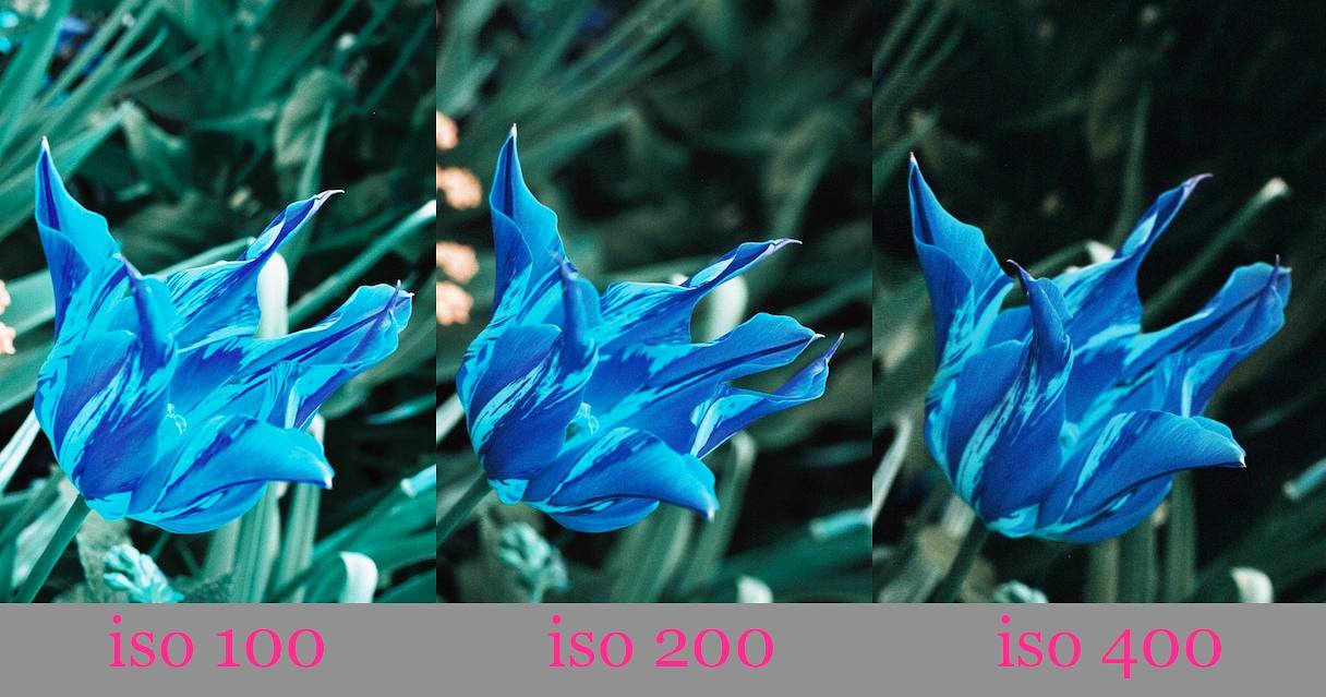
Depending on the exposure, this striped red and gold tulip turned majorly blue or turquoise.
Away from direct sunlight, my chili peppers got the best color saturation at ISO 100 but were underexposed at ISO 400. Instead of hot and spicy killers, these peppers looked more like mint candies on LomoChrome Turquoise.

Guide to Color Shifts
So what are the colors possible in this new film? How do different colors shift? Just take a look at this rainbow.

Red -> Blue
Orange -> Blue
Pink -> Purple
Yellow -> Turquoise
Green -> Dark Green
Blue -> Yellow/Orange
Purple -> Brown
Not convinced? Check out the wide spectrum of colors on this T-shirt below.

So there you go. If you want a lot of turquoise in your pictures, go shoot some lemons!
A Permanent Sunset
LomoChrome Turquoise has a blue-to-orange color shift. Because of our tendency to photograph blue skies, we see lots of orange in the Turquoise galleries, as if the world is permanently stuck at sunset. This eerie orange sky adds drama and is perfect for Halloween horror. We can, of course, alter that look with a color filter.


All About the Blues
The most dramatic effects of this film are the red-to-blue and yellow-to-turquoise color shifts. One way to maximize LomoChrome Turquoise is to shoot all things red and yellow. I can imagine a few blue apples, blue double-decker buses, some impressive iceberg-like canyons, not to mention a blue Santa Claus!


Shooting LomoChrome Turquoise is like having a fresh pair of eyes. We can now take a good look around and appreciate everyday objects before they dissolve into the background. See the rich tonal variations in these bricks that would look ordinary otherwise.

This new film is weird and wonderful. Its look is more Tim Burton than Frozen. Some Lomographers might even have a field day hunting Smurfs or battling Frankensteins. If you are going for a specific color, do take note of the color shifts and plan ahead. Will a red apple look as interesting as one that has striations?
I have been banging on about the color palette of LomoChrome Turquoise, but how unique is it? Seasoned Lomographers will remember that the sky is frequently awash with cyan in LomoChrome Purple. The same also happens in a few cross-processed slide films like Kodak Ektachrome 100, Elite Chrome 100, Fuji Sensia II 200.


The difference is, in LomoChrome Turquoise, the blue and cyan tones can serve as accents. So the question is, where do you want your turquoise?
You can find more of my LomoChrome Turquoise shots in my album Turquoise & Sapphire.
written by ihave2pillows on 2015-06-13 #gear #review #blues #cyan #color-shifts #lomochrome-purple #lomochrome-turquoise


7 Comments